Loading…
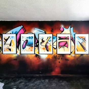
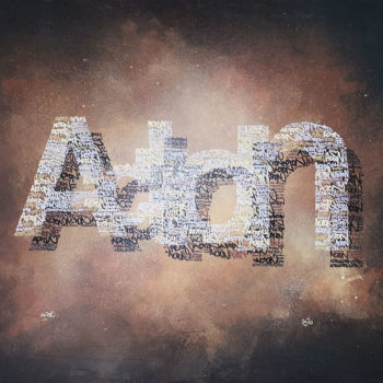
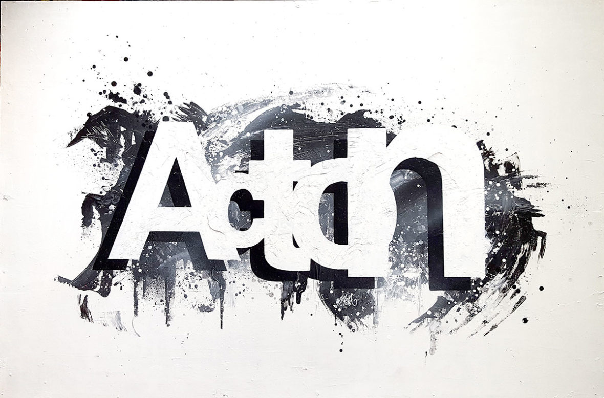
Marko Acton Saarelainen: Acton / HELVETICA
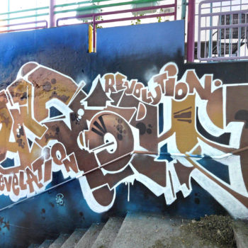
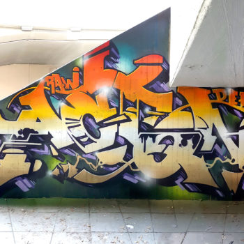
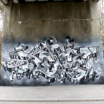
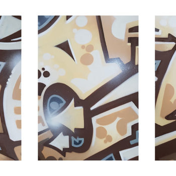
One of the most used fonts in western typography seems to be Helvetica. You can spot it in the logos of large companies as well as info/billboards and advertisements to the point where it totally bores the hell out of you. Or actually, since the letter is so neutral, almost grey, you don't get bored to it since you don't pay any attention to it. The typeface is nearly genius in design because it works perfectly as a messenger, allowing recipient to focus 100% on the message instead how it is presented. So I played a bit with the contrast between graffiti and Helvetica-font during my "Acton - Literally" solo exhibition which took place in 2016 at Make Your Mark -gallery. This is one of the paintings where my moniker "Acton" is presented with overlapping, slightly different size Helvetica Bold letters. The same painting was also on display at "For The Love Of Freedom" exhibition and "Art Fair 2017".